Via lots of people, here is a graph of the underlying HTML structure of the Kaedrin Weblog:
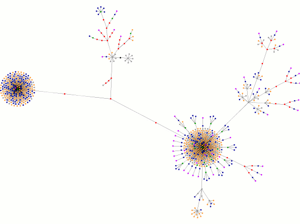
Each dot represents some aspect of this page. The application that generated this graph uses the following color codes:
What do the colors mean?
blue: for links (the A tag)
red: for tables (TABLE, TR and TD tags)
green: for the DIV tag
violet: for images (the IMG tag)
yellow: for forms (FORM, INPUT, TEXTAREA, SELECT and OPTION tags)
orange: for linebreaks and blockquotes (BR, P, and BLOCKQUOTE tags)
black: the HTML tag, the root node
gray: all other tags
So what are we looking at in my graph? (One note, I generated this graph last night before I posted, so this graph reflects a page that has changed.) Well, the big clump of orange and blue on the left side of the graph is obviously my side navigation, filled with links and line breaks (i.e. the blogroll and archive links). The other big clump of orange and blue (bottom right) is the main area of posts on the page. Because I’ve recently gone on a spree of posts with lots of images, there is also a bunch of violent in that area. The image filled posts are also the cause of the offshoots from this area, as I’ve foolishly used some tag-soup to get the layout right. I believe the remaining offshoot, in the middle of the graph, is the masthead (the top of the page with the Kaedrin logo and main navigation links).
It’s not as pretty as those nifty XHTML/CSS pages, but it gets the job done (and it validates!) One of these days I’ll get around to actually converting this layout to XHTML and CSS, but don’t hold your breath. I tried to exactly replicate this layout once and just got frustrated, so when it happens, it will probably be accompanied by a minor design overhaul.
I’ve never seen a graph like that before…that’s kind of neato. Of course, I am a math geek and therefore predisposed to liking things like that, but still, I think it’s cool. = )
That is *really* cool. Foucault, did you look through the flicker gallery of images? People have been posting images of their maps in there, and some of them are very very cool looking. I think it’s interesting how much they vary from website to website. Some look almost like molecules to me, but some are really complex and almost beautiful.
http://www.flickr.com/photos/choconancy/158278924/
http://www.flickr.com/photos/guero/157193784/
http://www.flickr.com/photos/deeknow/157592973/ (might be my favorite)
Heh, yeah, it’s pretty neat to plug various sites into that thing. Some interesting graphs show up…